Finding Inspiration in Illustration: Five Extraordinary Illustrators
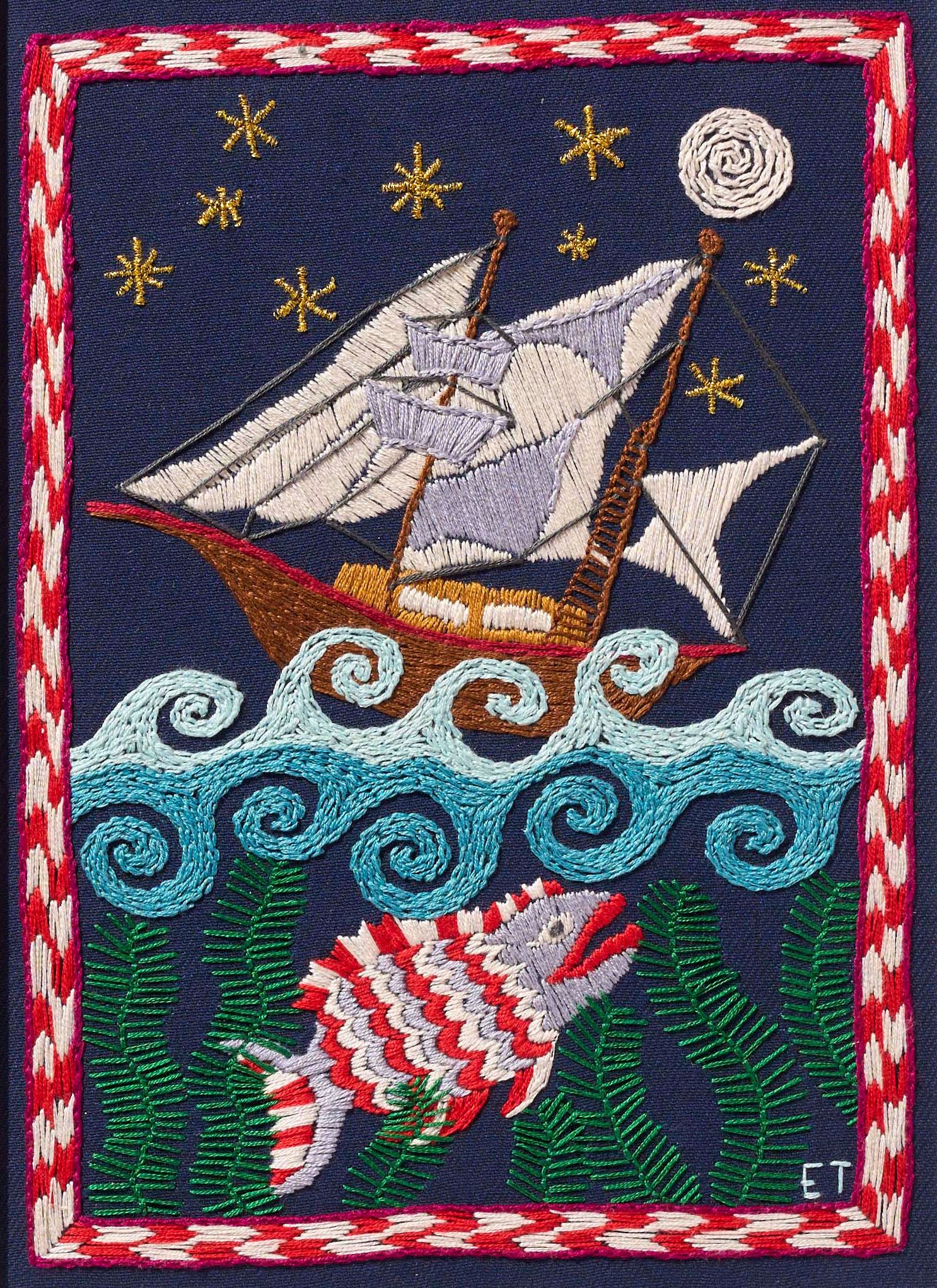
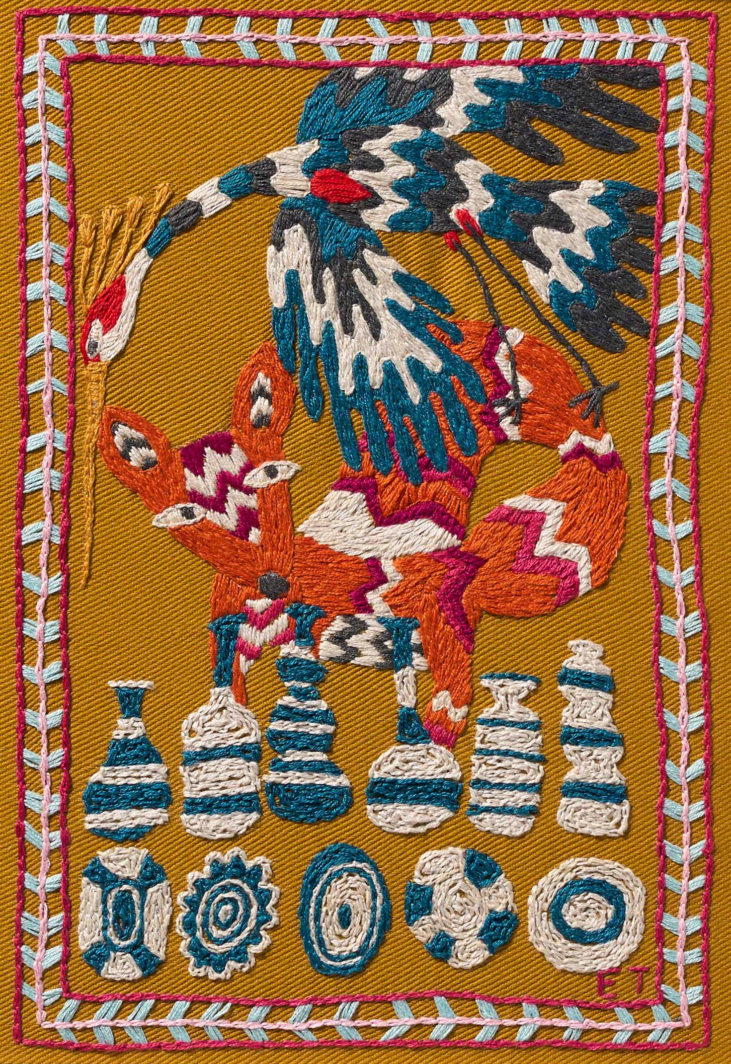
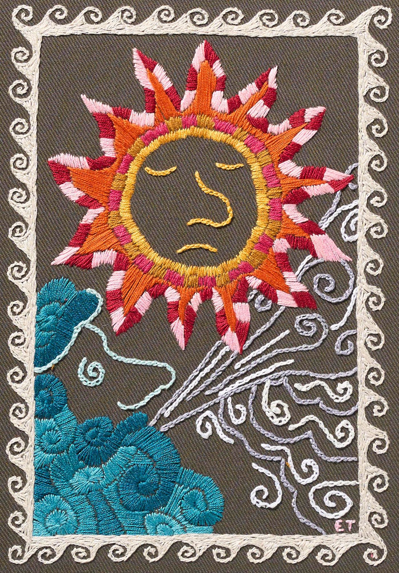
I have long drawn inspiration from the work of illustrators – excuse the pun! In many ways, embroidery and illustration are somewhat closely related, second cousins, if you will. Often, illustrators work initially in black line drawings, and then overlaid with a very simple and bold colour palette, which is not dissimilar to the way I plan and execute my embroideries. I totally separate the process of creating my designs and choosing the colour palettes. All my designs are initially drawn in black and white, so, effectively, at their core my designs are illustrations. I cover this whole process on our freestyle embroidery course, so do have a look at it if you too are inspired by these five illustrators, who are some of my favourites!


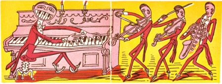
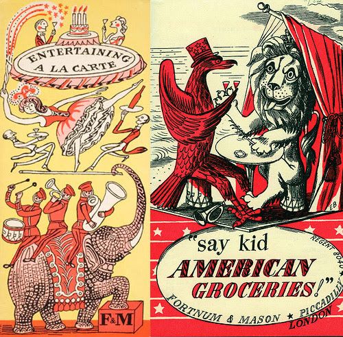
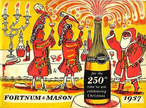
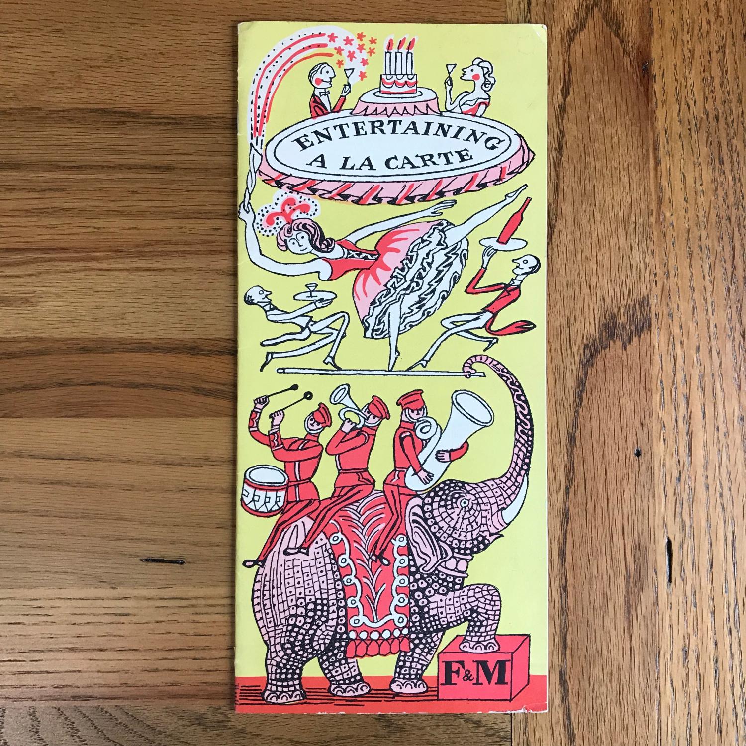
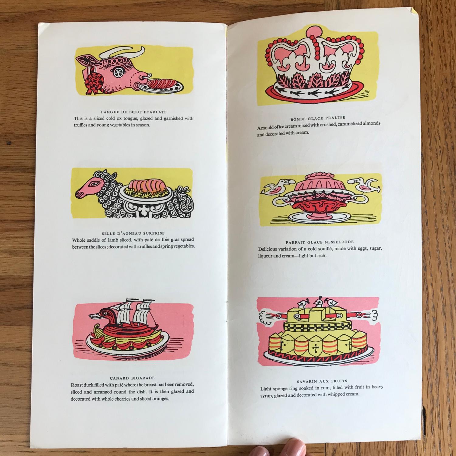
Edward Bawden (1903-1989) was a printmaker, illustrator, watercolourist and designer of posters, tapestries and theatre decor who was active throughout the 20th century. He studied at the Royal College of Art under Paul Nash, and went on to become an Official War Artist during the Second World War in France and the Middle East, and painted numerous murals.
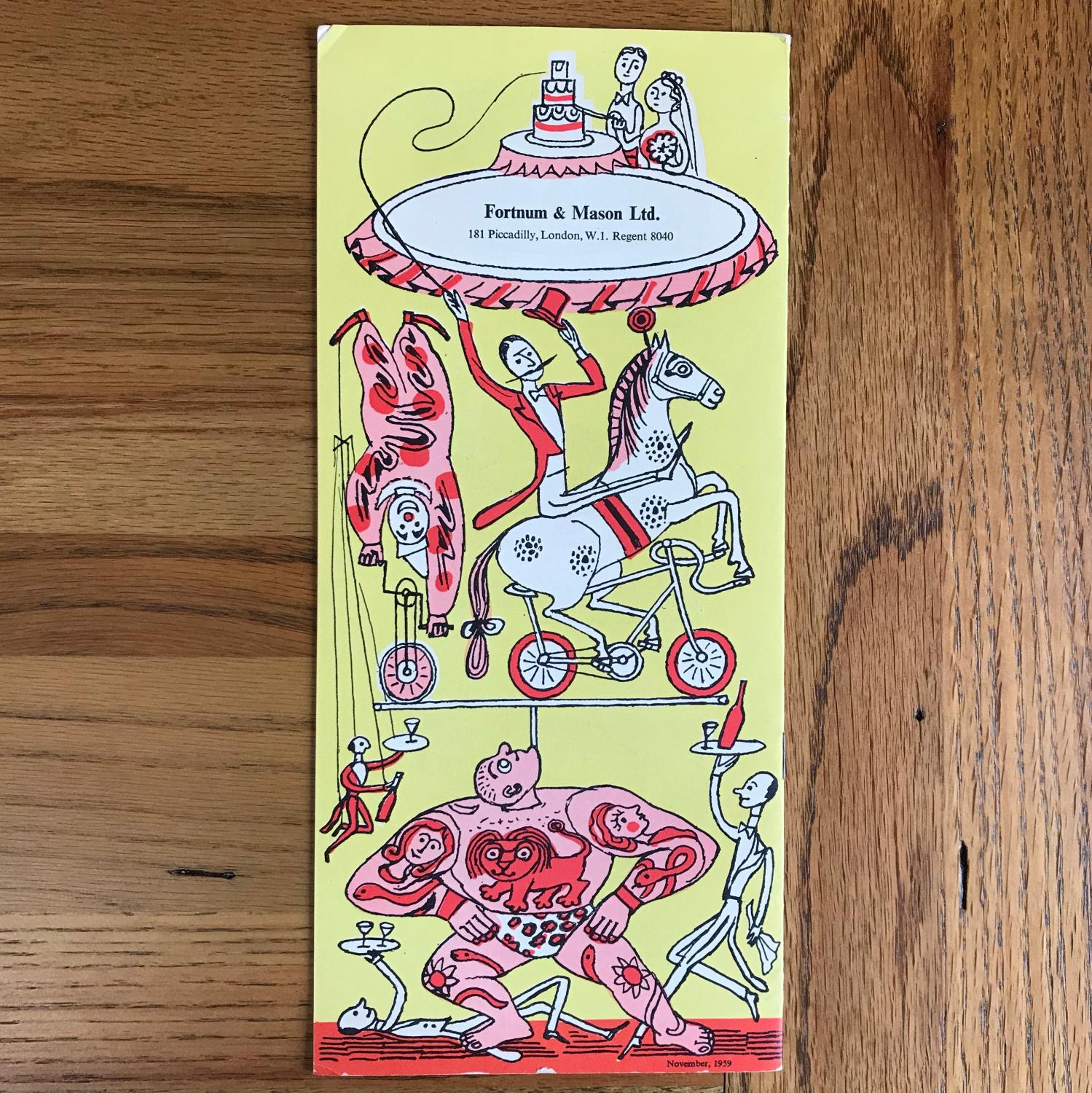
He worked extensively as a commercial illustrator for companies such as Twinings and Fortnum & Mason and, in my opinion, these drawings are among his best. They are simple line drawings, often coloured with just one or two primary colours, however are somehow still full of movement. They are whimsically witty, fizzing away with visual puns.
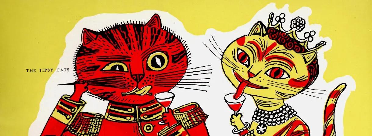
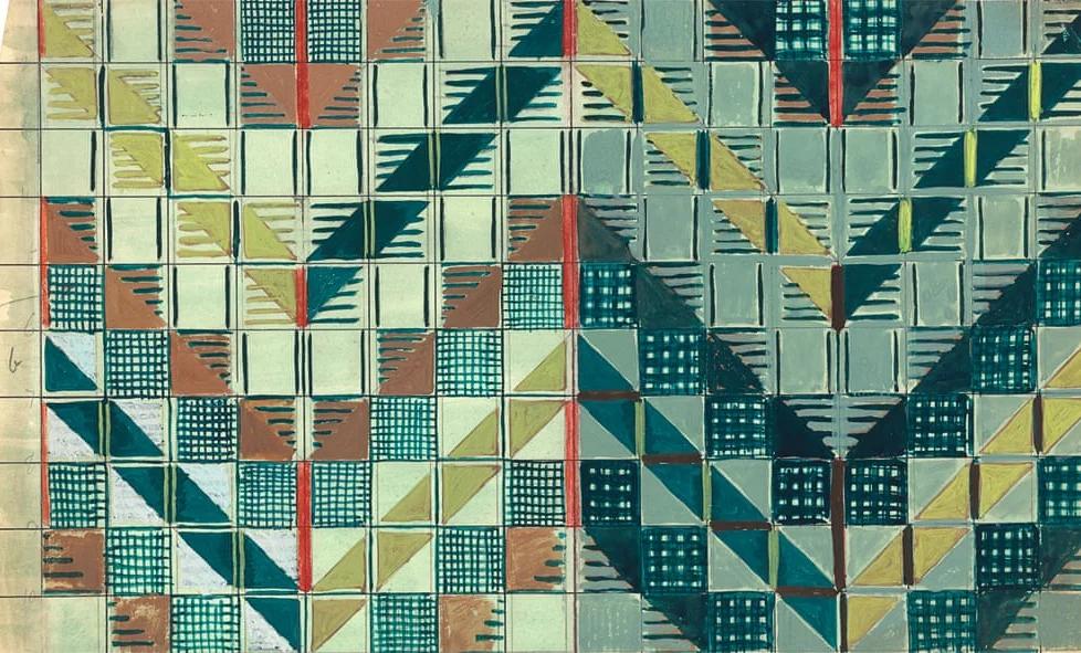
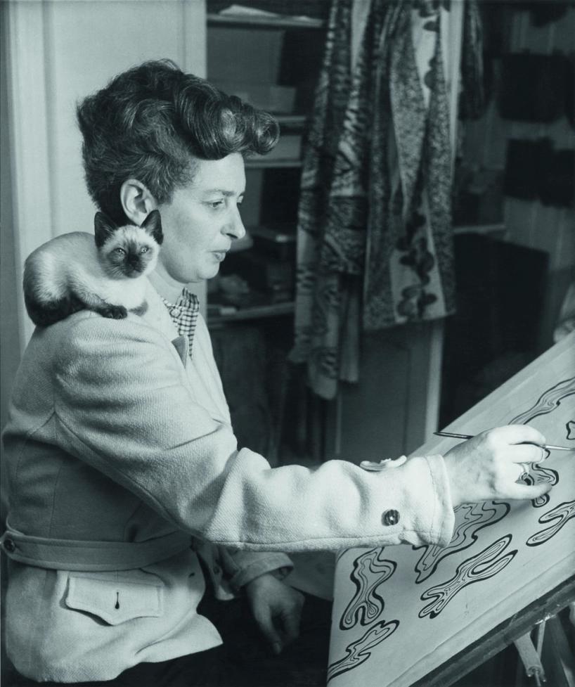
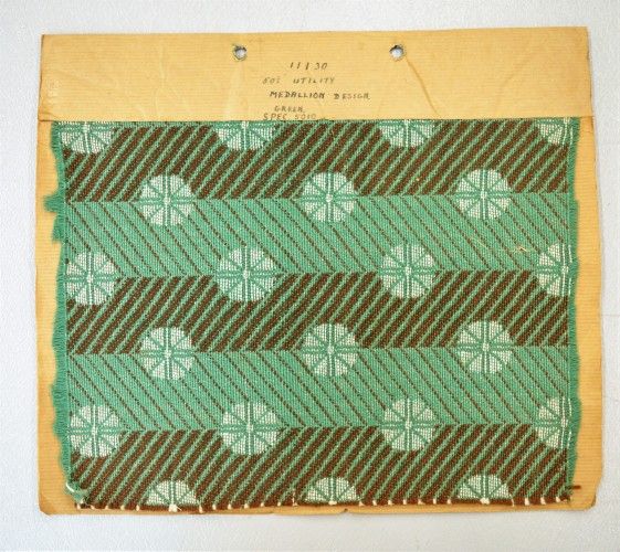
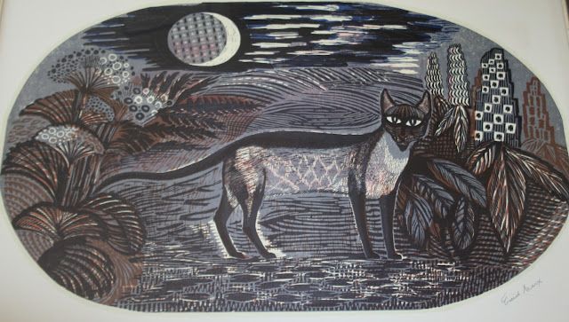
Enid Marx (1902-1998) was an influential artist and designer whose work varied from textile design, printmaking, book illustration and even postage stamps. She studied at the Royal College of Art (RCA), under Paul Nash, among others, with fellow students, and future RDIs (Royal Designer for Industry), the aforementioned Edward Bawden. Despite her assessor failing her diploma piece for being too abstract, sixty years later Marx was appointed an Honorary Fellow of the RCA in 1982 and Senior Fellow in 1987.
Nash especially recognised her skill and originality as a pattern designer, and encouraged her to become an early member of the Society of Wood Engravers and the Society of Artists. In 1926 she established her own studio, printing her abstract and geometric designs onto various materials.
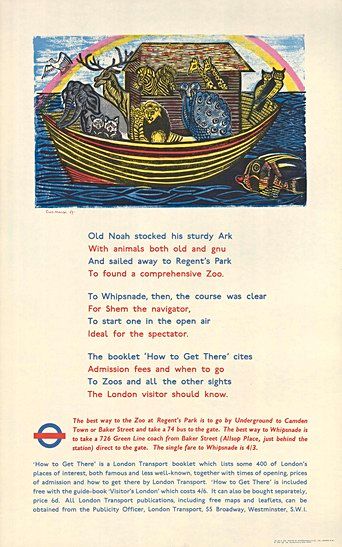
Among her many clients were London Transport, for whom she designed moquette seating fabric for Underground trains and posters promoting the network. Both her illustrations and her patterns are characterised by strong lines, simplified shapes and a muted colour palette. They provide ample inspiration for embroideries, and I urge you to look through work when creating your own freestyle designs.
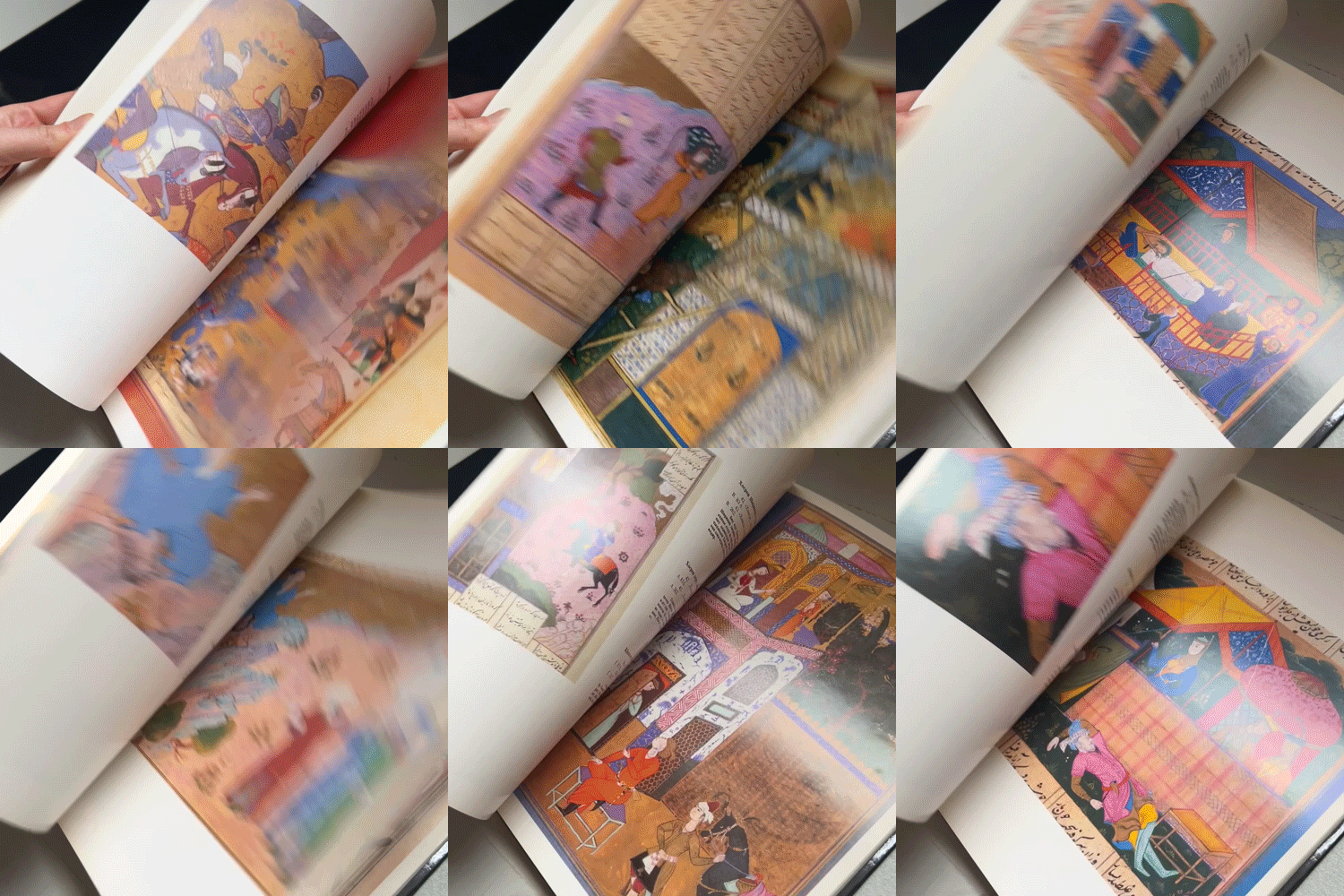
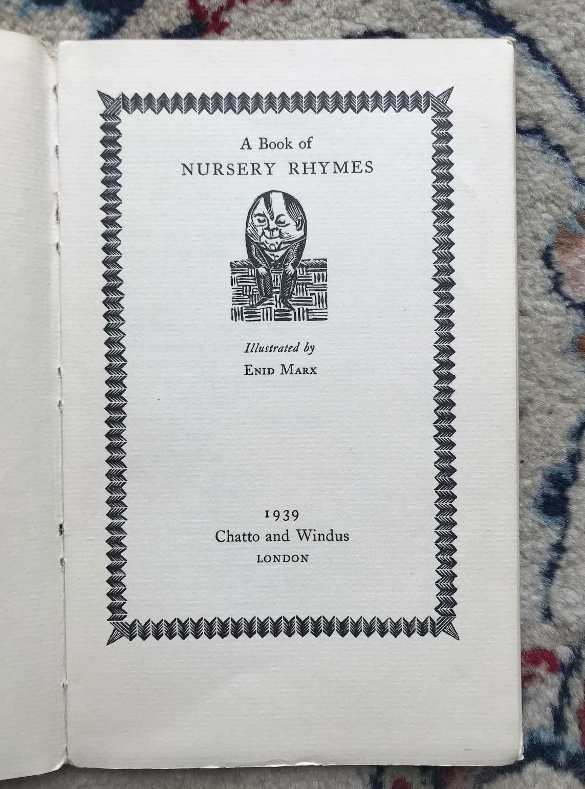
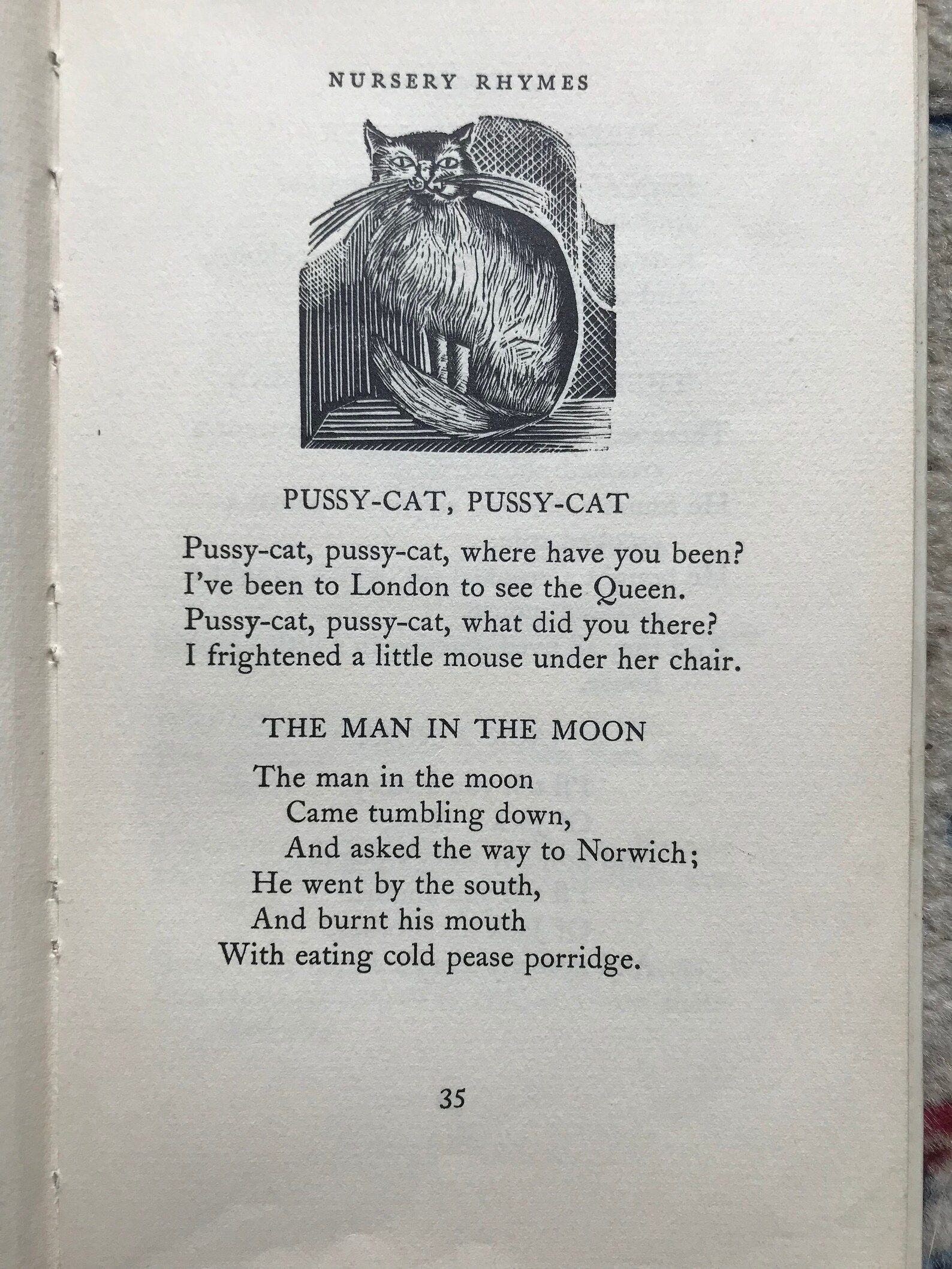
I am a proud owner of a copy of her woodcut illustrated nursery rhymes published by Zodiac books in 1939. I have visions for a series based on nursery rhymes so this book is travelling everywhere with me at the moment. See the end of the images for a few snapshots from it.


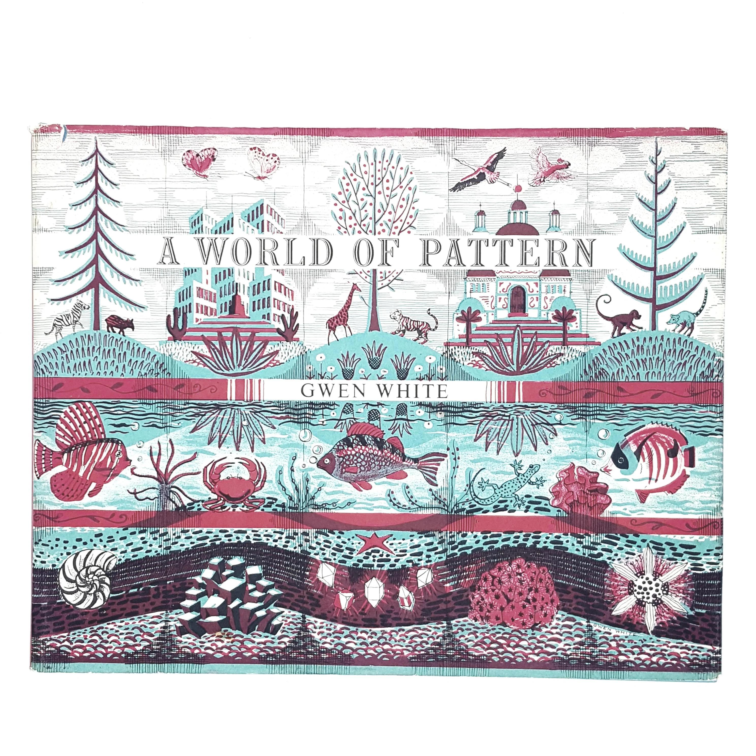
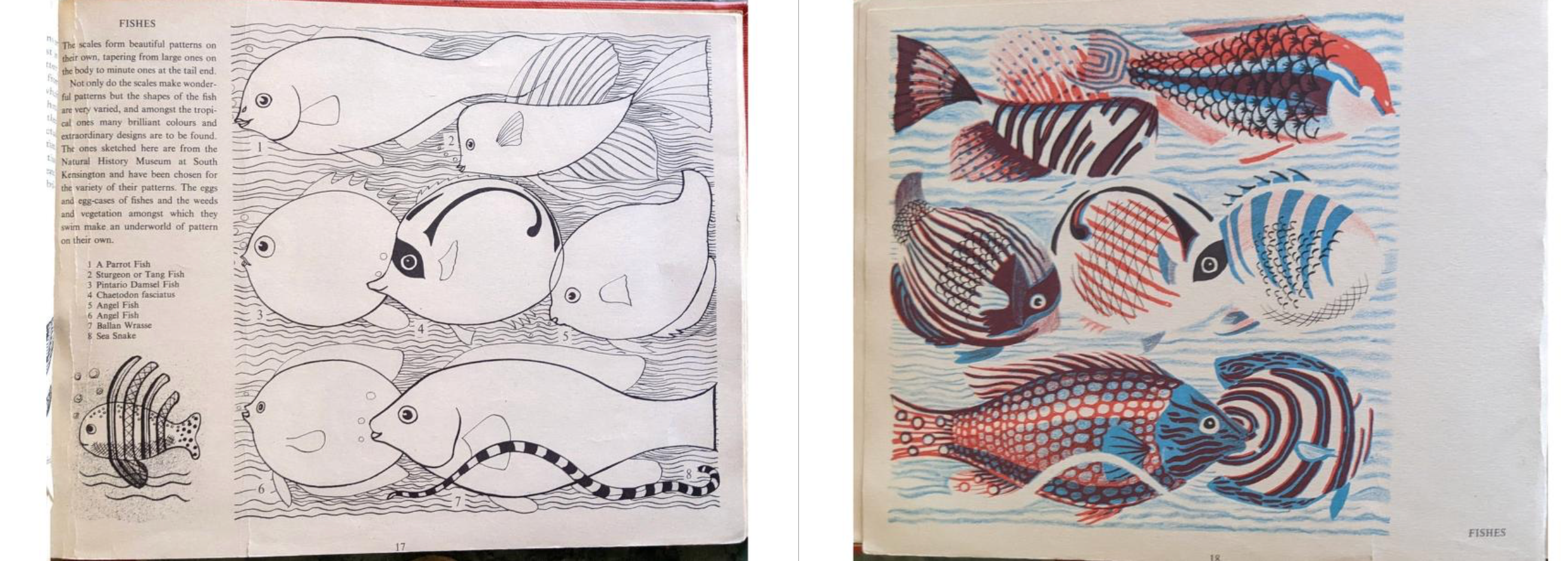
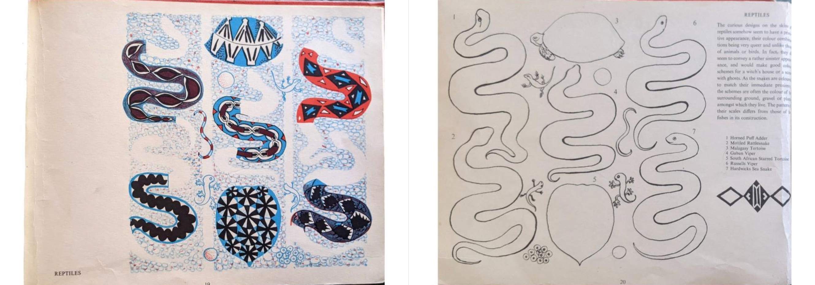
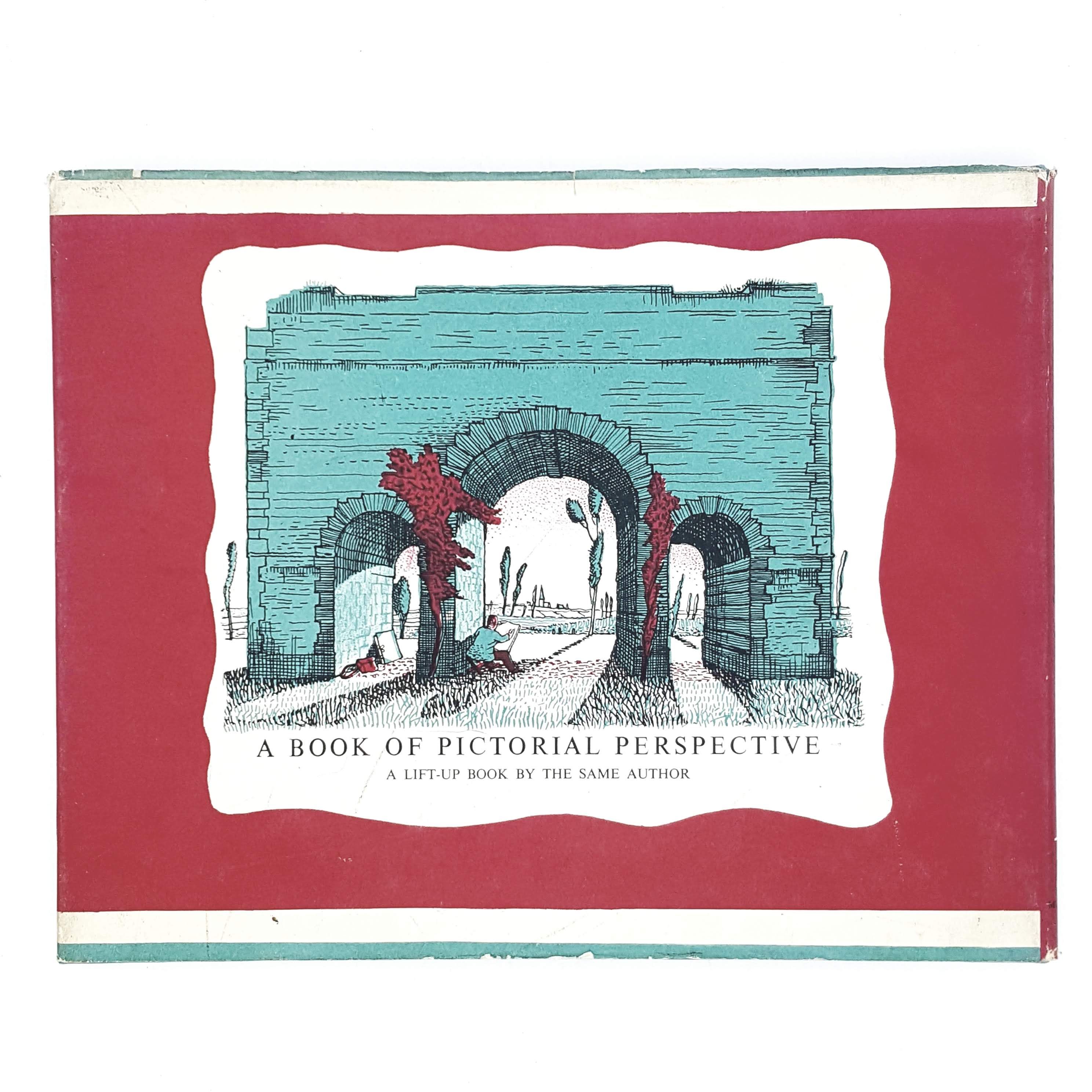
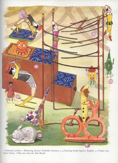
I first came across Gwen White’s illustrations via Joe Person and his Instagram account Design for Today, that shared pictures of Gwen White’s 1957 book ‘A World of Pattern.’ Her life is relatively undocumented, however she studied at Bournemouth School of Art and the Royal College of Art during the early decades of the twentieth century. Between 1933 and 1946 she was a regular illustrator of Enid Blyton books, and she went on to publish many other books, including ‘A World of Pattern,’ and an instruction manual
Gwen’s work, like so many of these other illustrators’, falls somewhere between pattern and illustration. In the book, she breaks down drawings into their most basic forms, demonstrating how to use simple shapes as a starting point for more intricate drawings. Her combination of simple lines filled in with intricate patterns resonates with how I design and then create my embroideries, and seeing the way she works shows the benefits of experimenting layers different patterns in this manner.
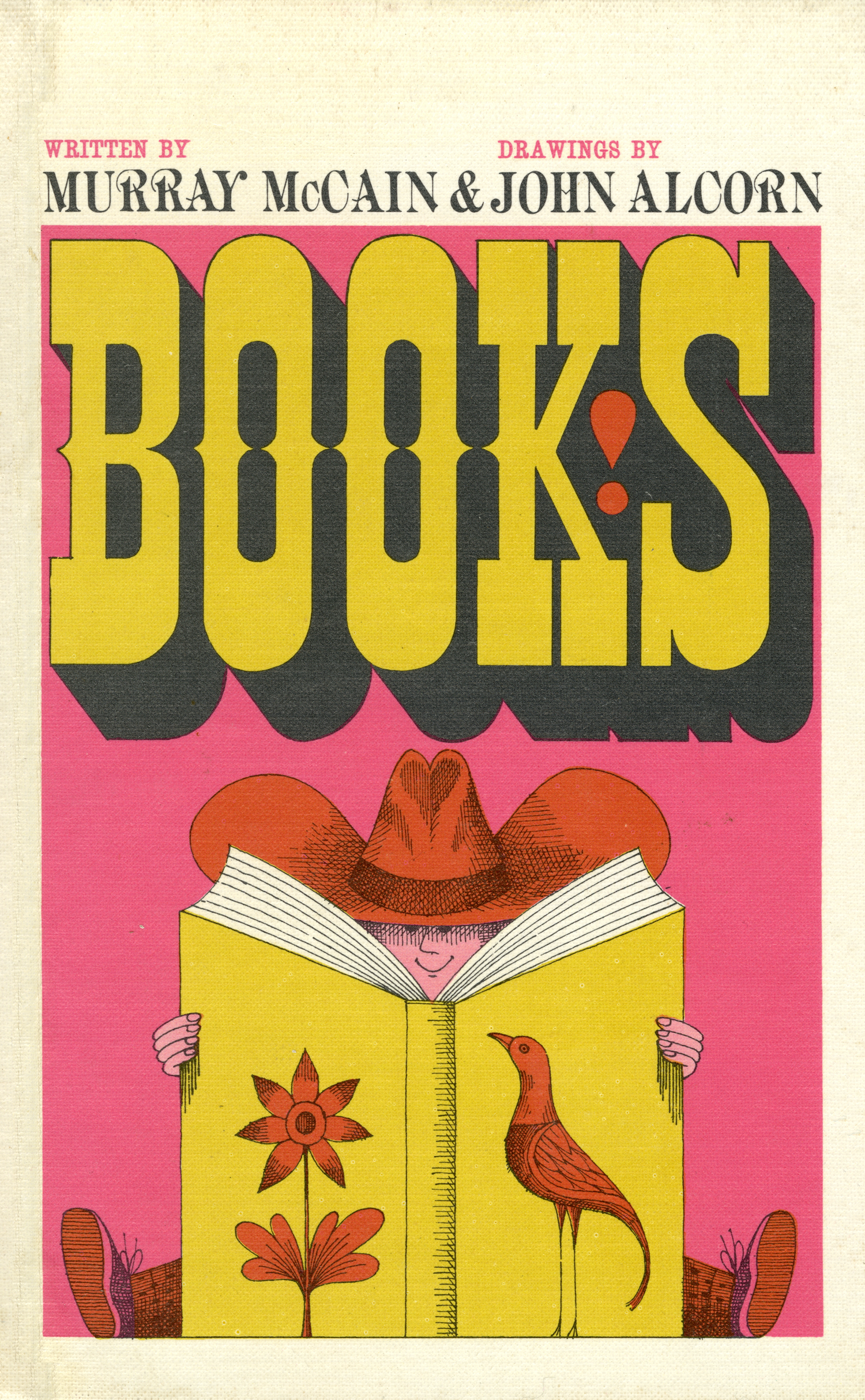
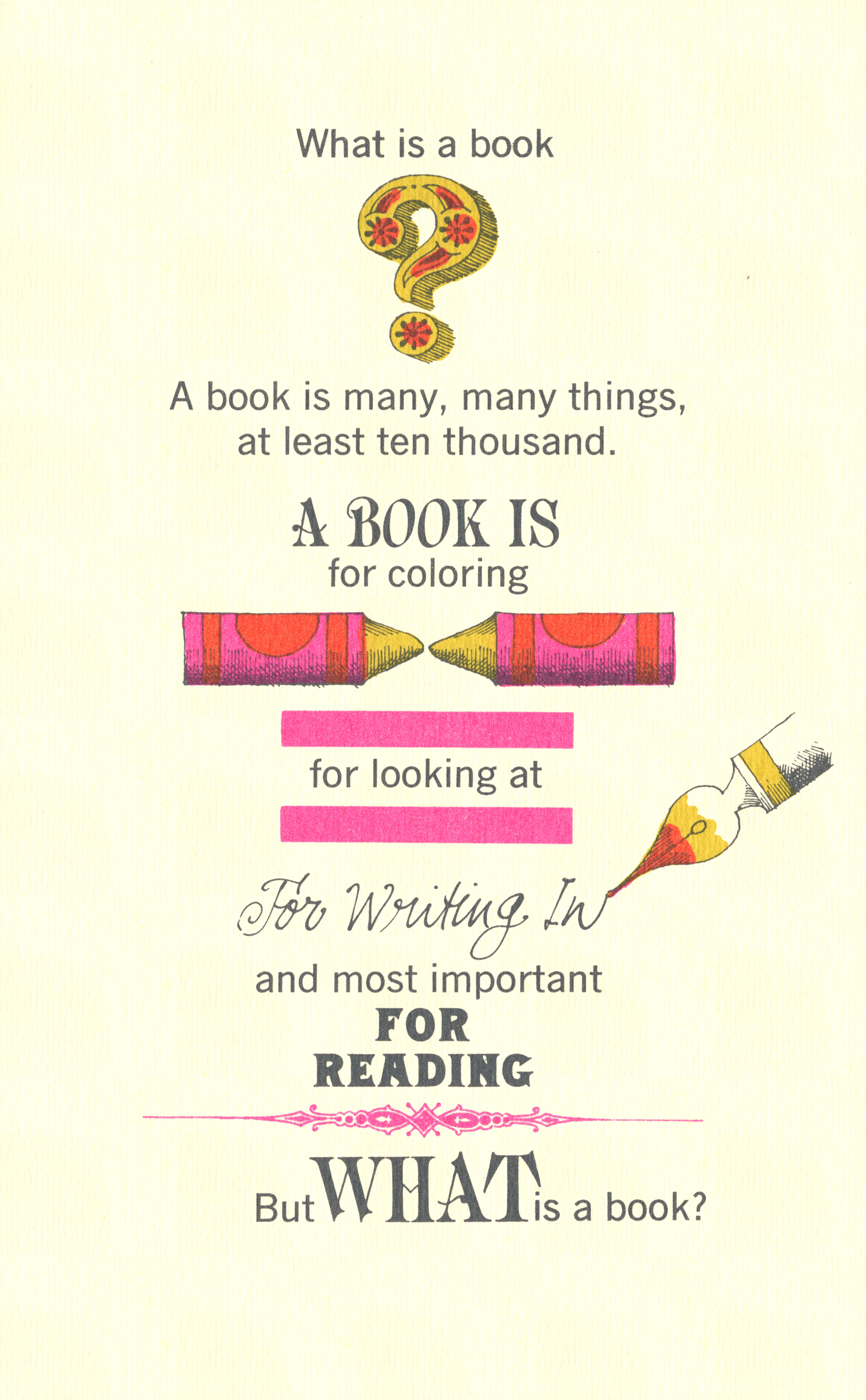

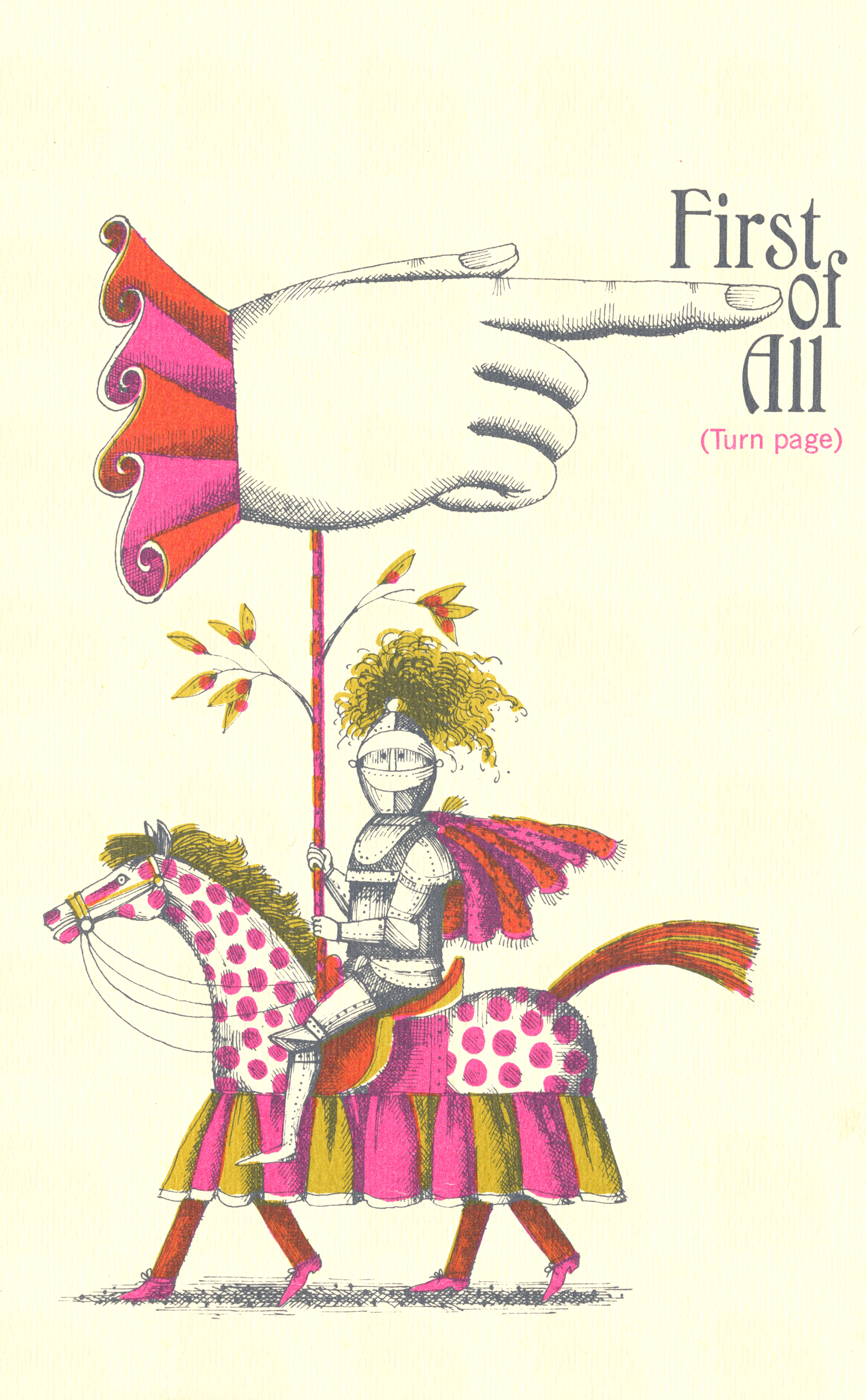

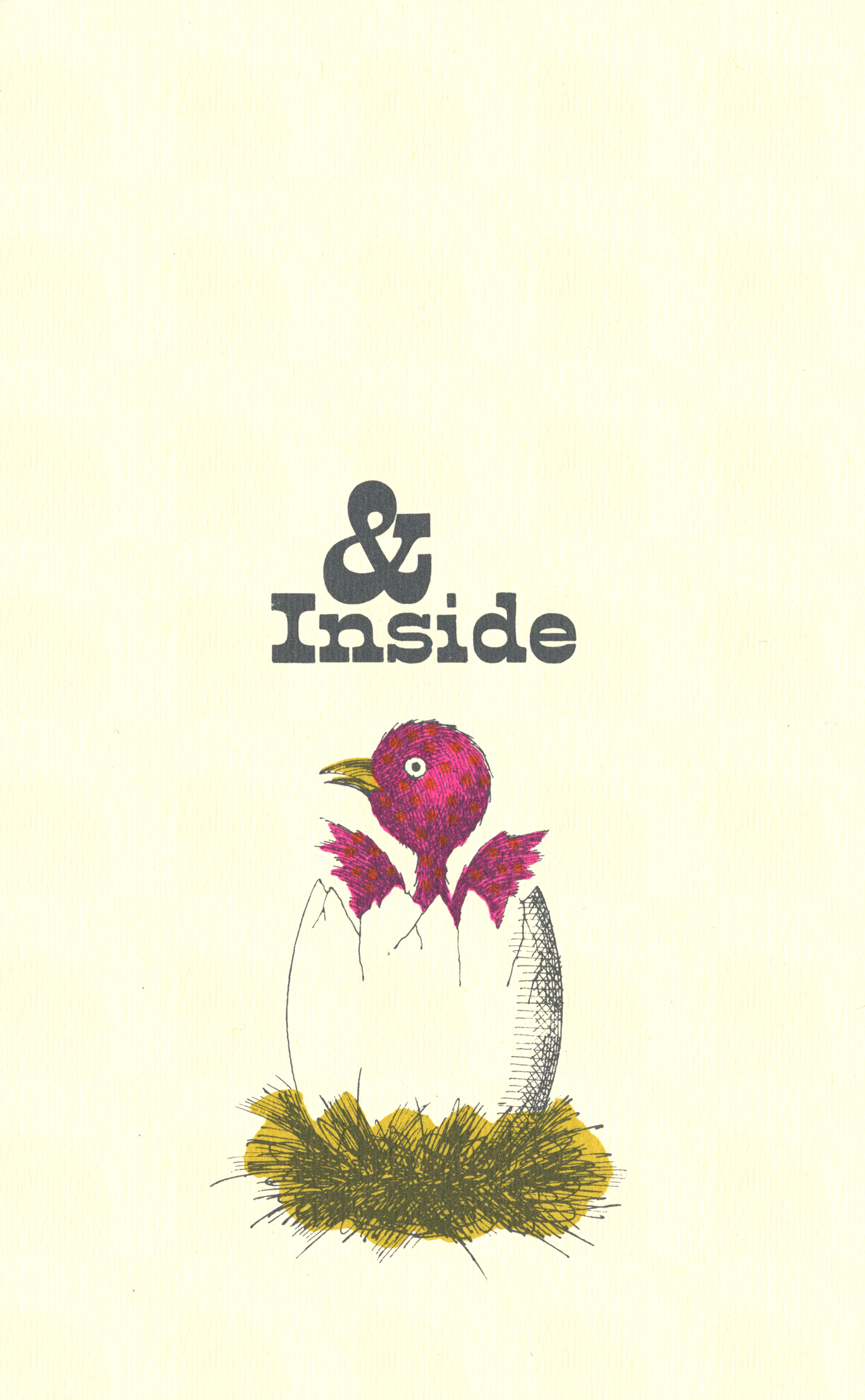

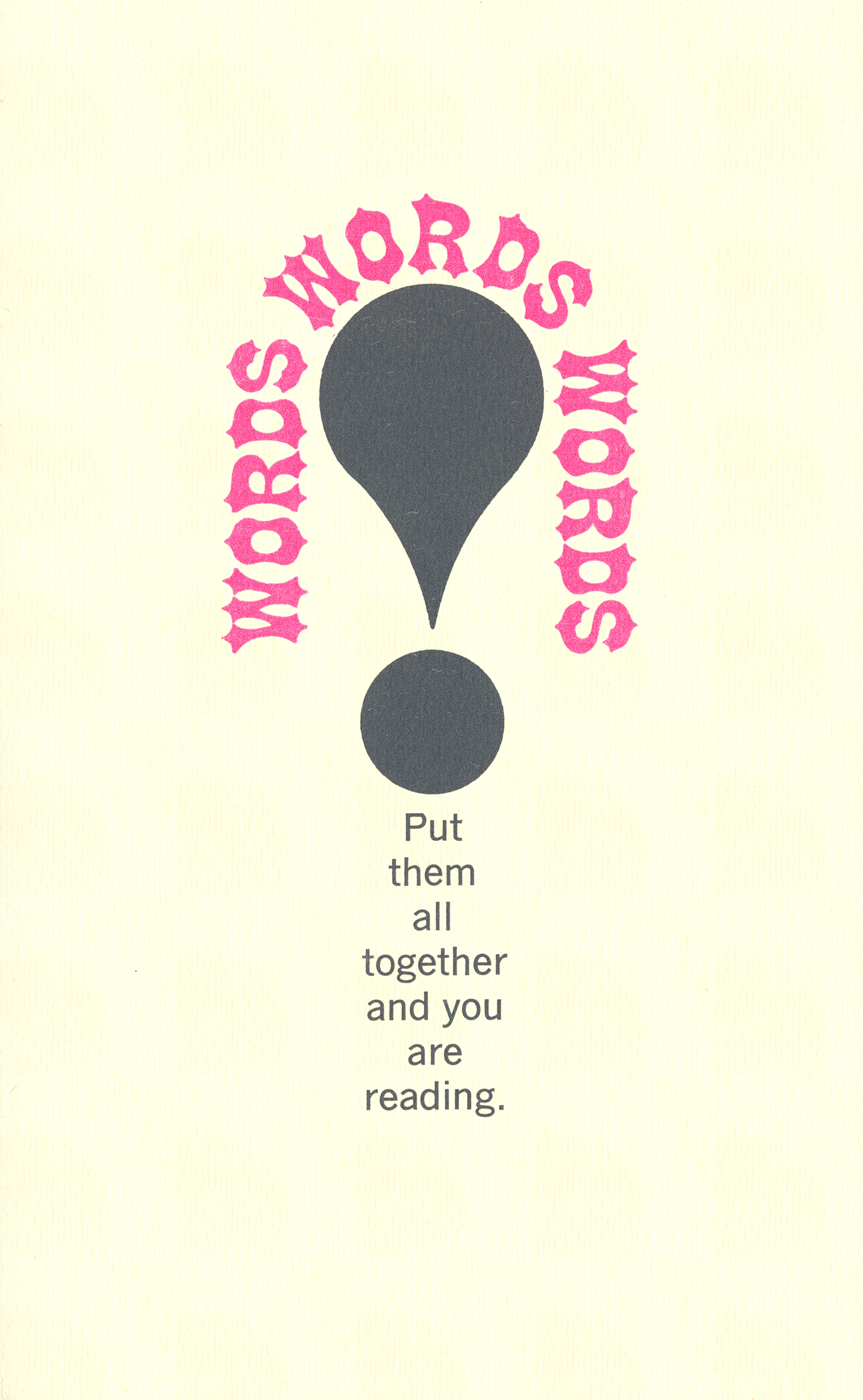
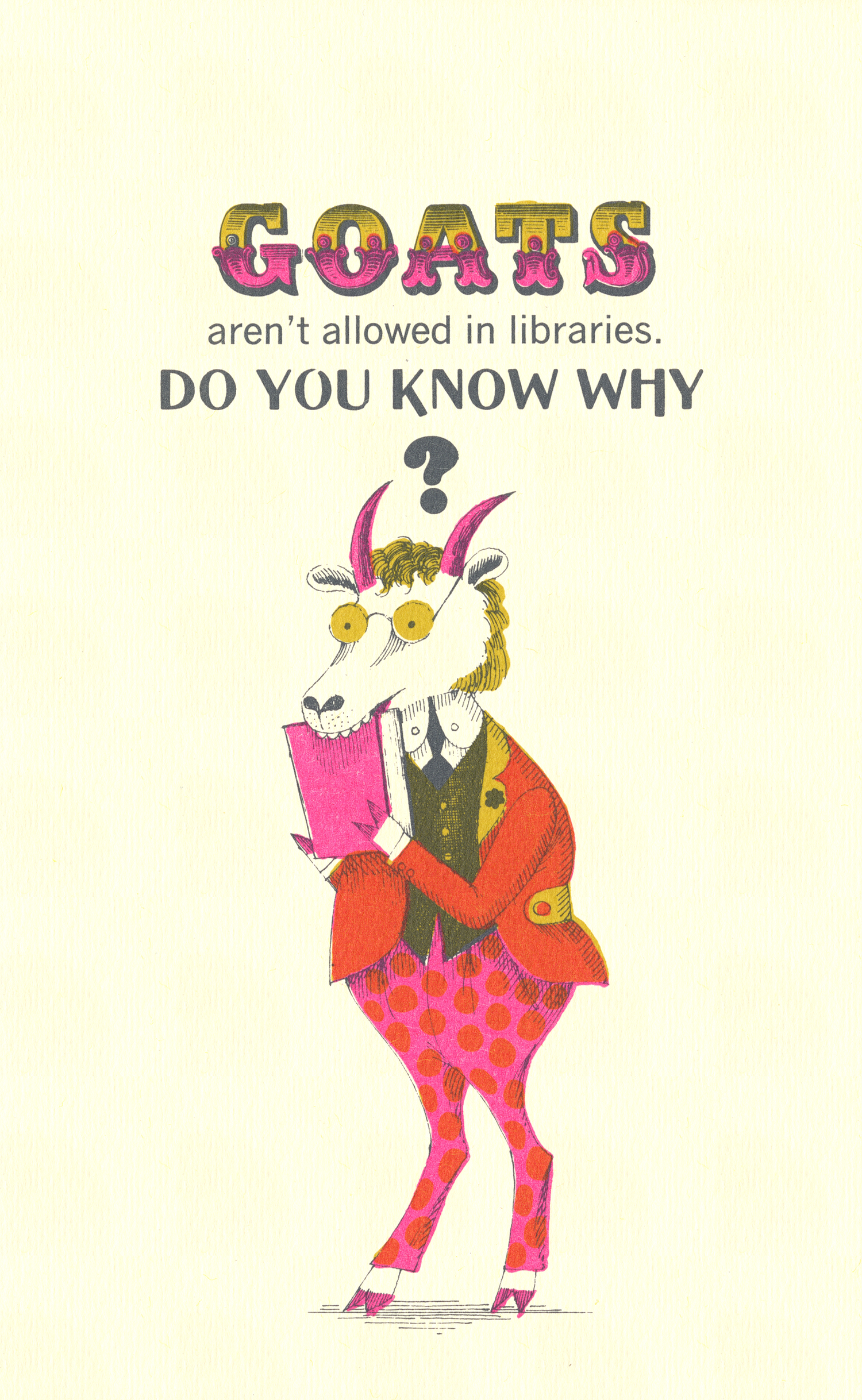
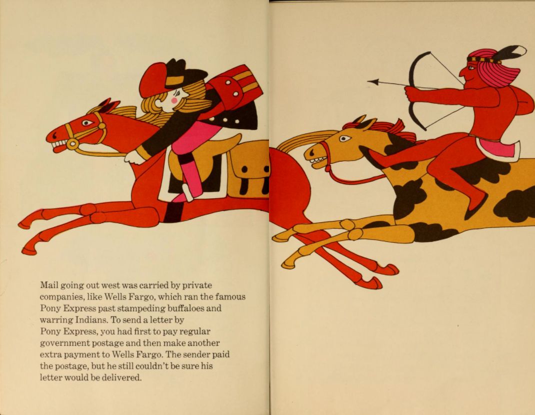
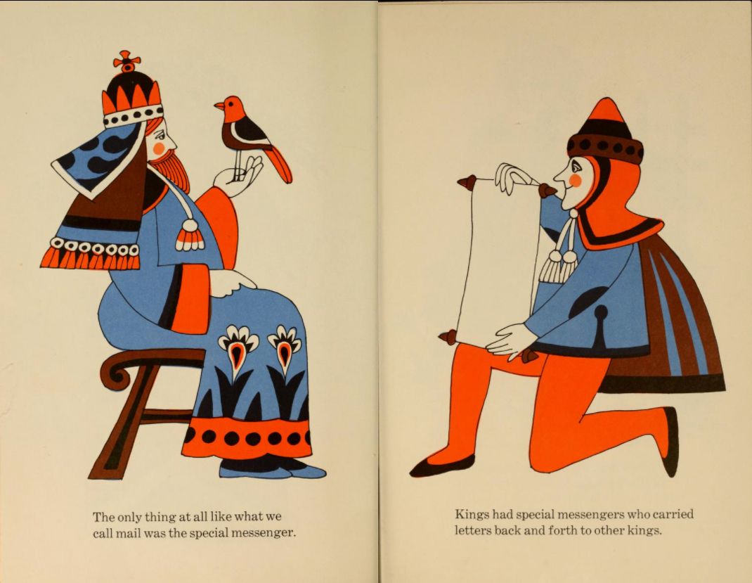
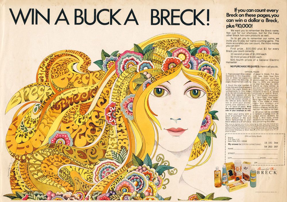
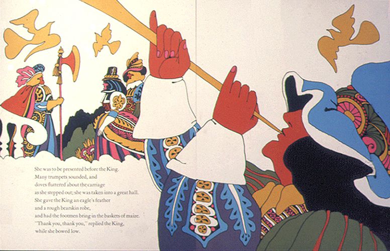
John Alcorn (1935–1992) was an American graphic designer and illustrator. His career saw him design for a variety of different media, from children’s books to packaging, The New York Times to album covers for the likes of Jimi Hendrix. His illustrations are made up of simple, flowing shapes and areas of solid block colour, and have a very nostalgic, ‘70s feel.
I particularly love the book ‘Books,’ written by Murray McCain and illustrated by John Alcorn, which is full of witty plays on text and images. The illustrations are simple, yet full of life, and interact with the text in a way that really brings the book to life. His combination of strong, simple lines, blocks of bold colour and flattened would translate particularly well to any embroidery project.
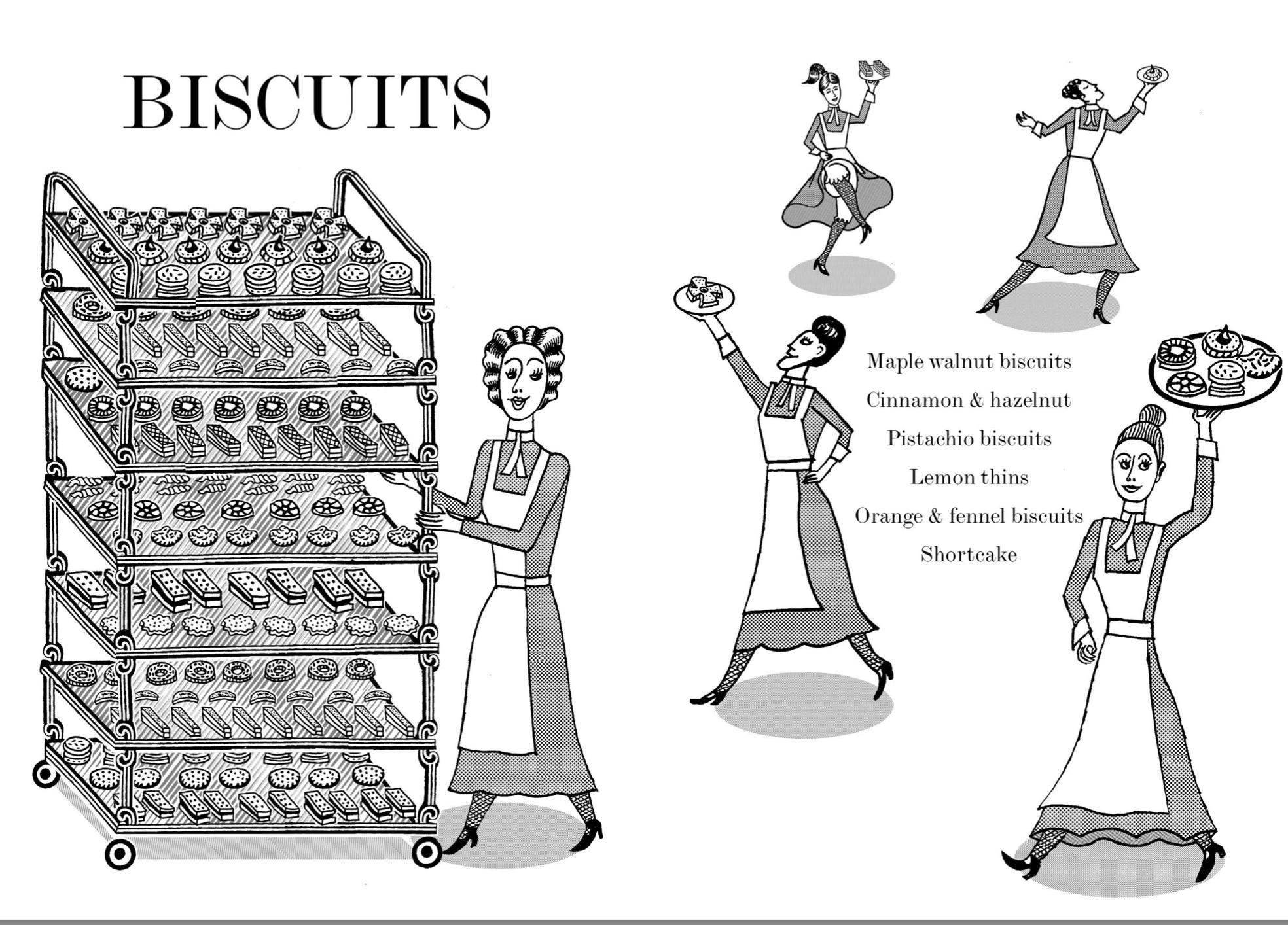
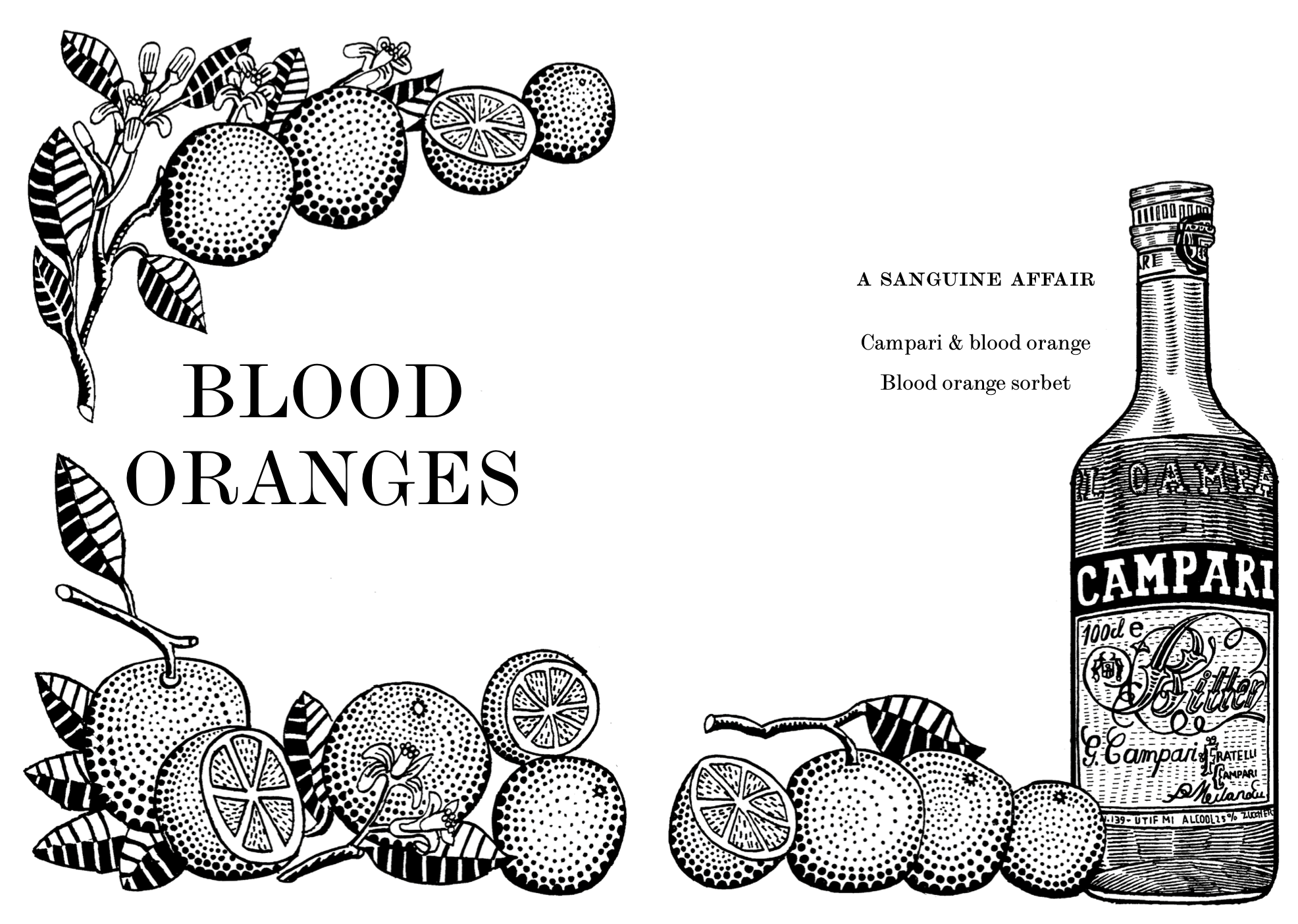
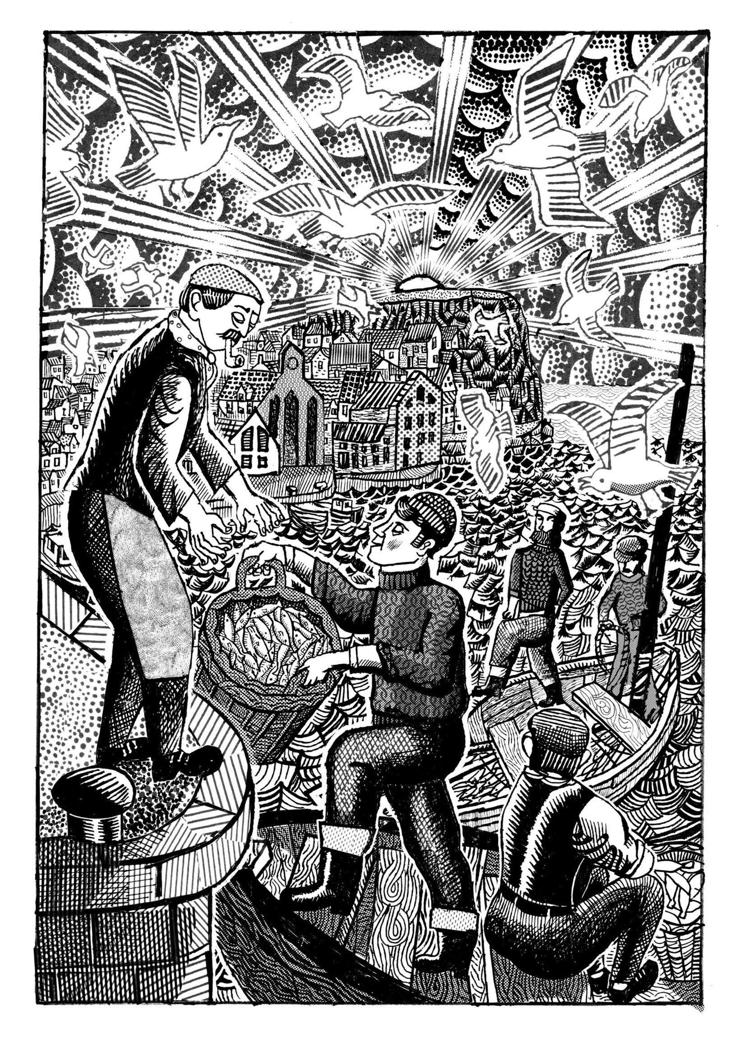
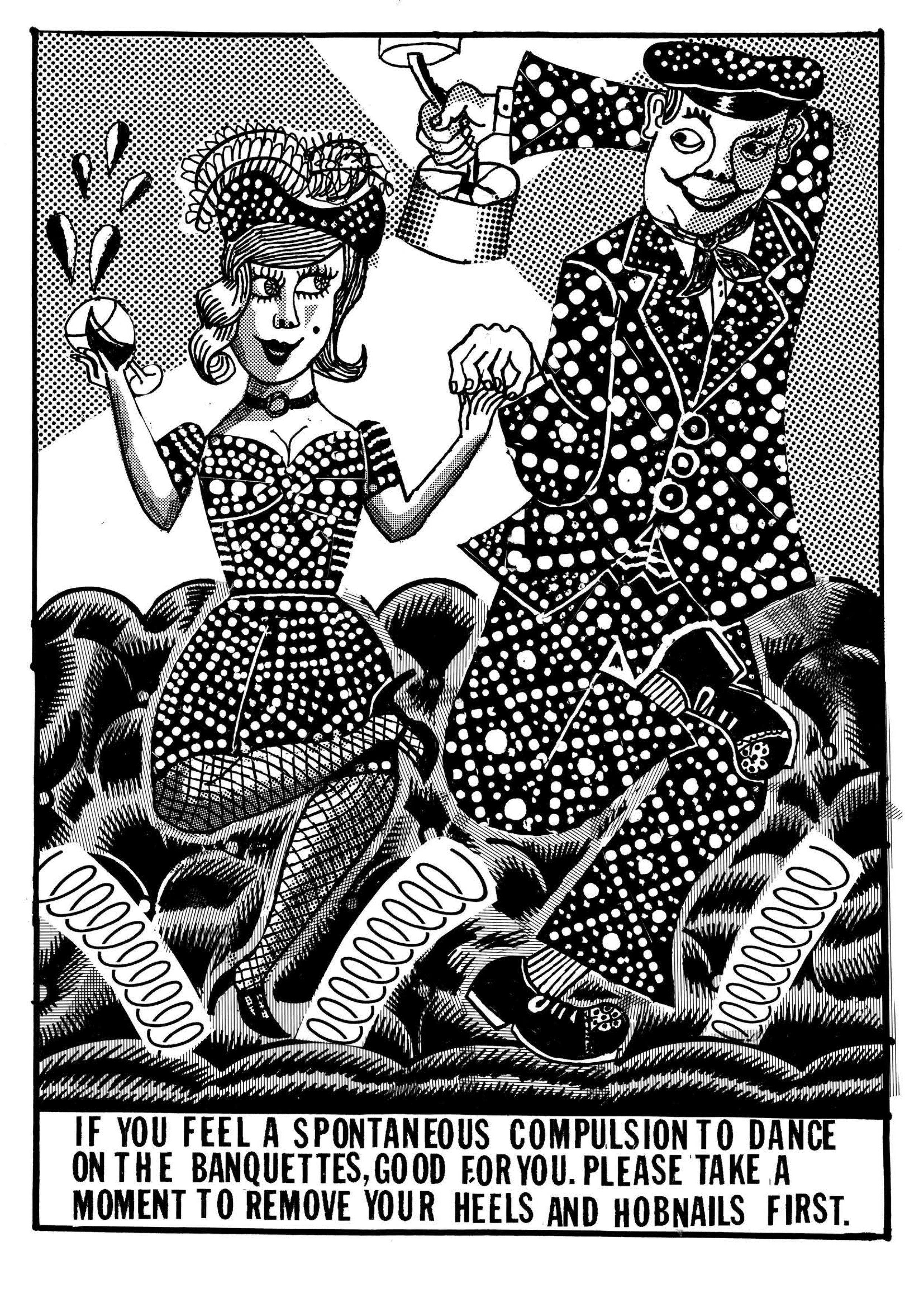
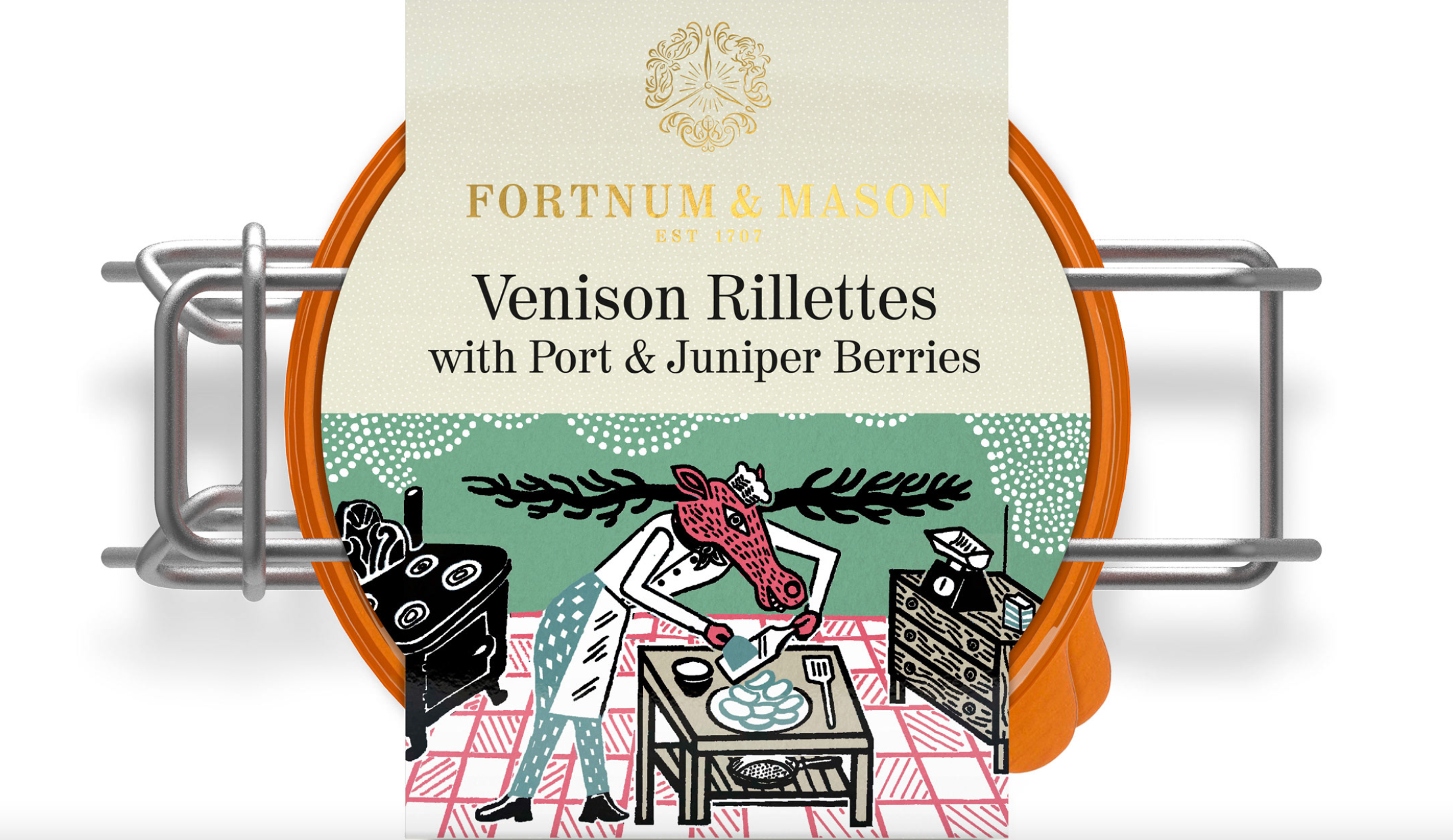
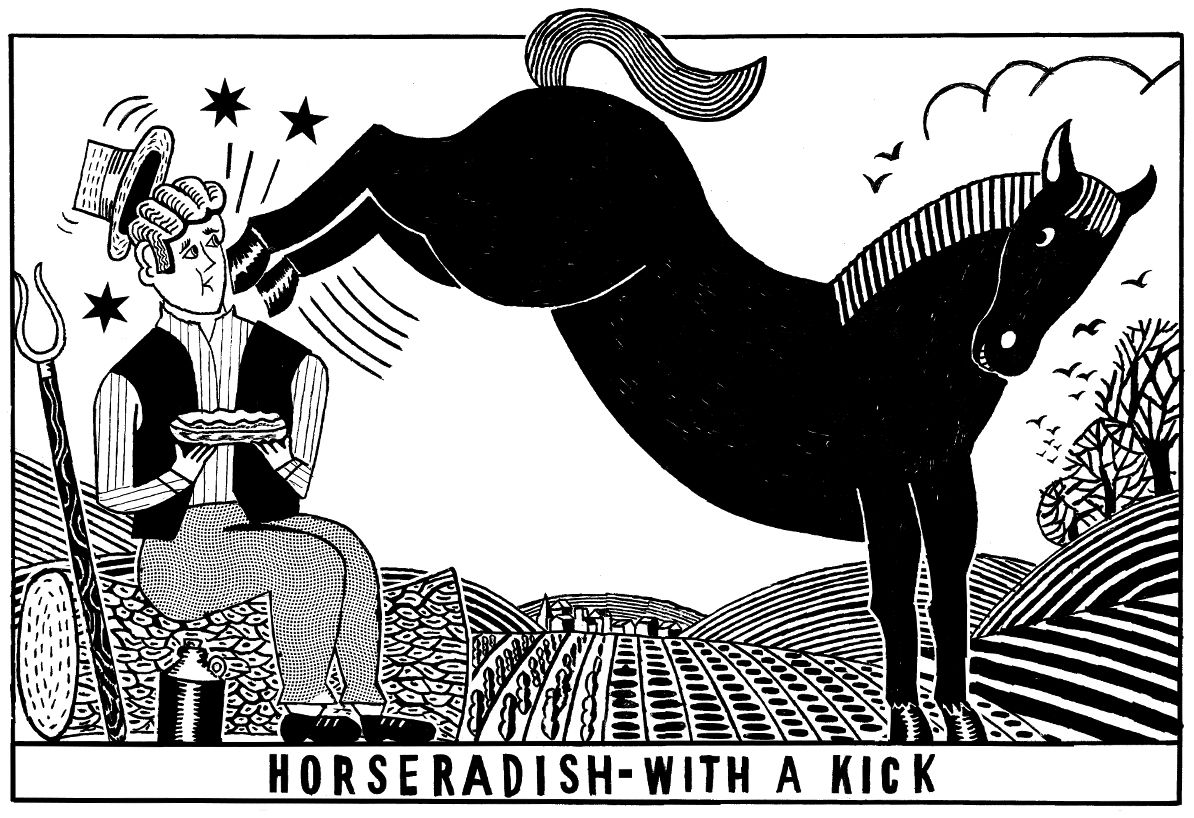
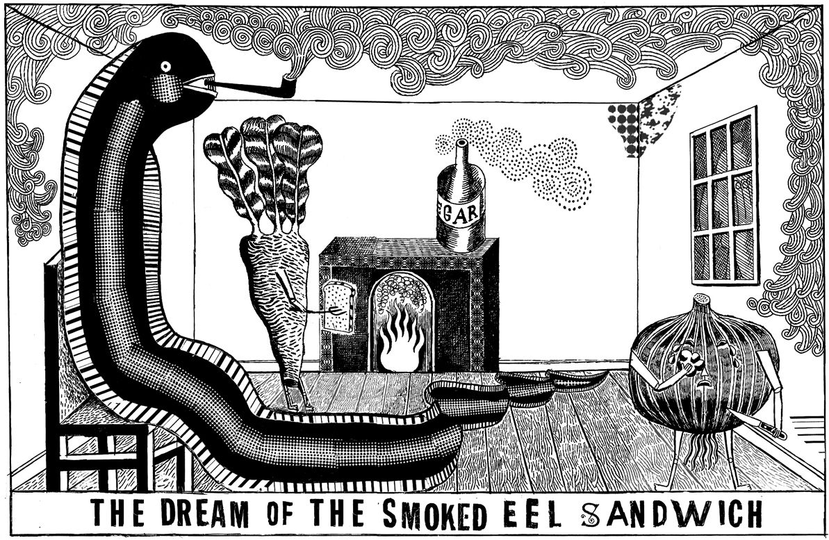
British illustrator John Broadley (is the only one of the set who is still alive and has been working since the 1990s. He is renowned for his unique and charming artistic style. Based in London, Broadley's work spans editorial illustration, book covers, and gallery exhibitions. He brings a distinctive blend of wit and nostalgia to his illustrations, and captures the essence of everyday life with whimsical and intricate scenes. He builds up his monochromatic drawings with multiple short, parallel lines (in much the same way that a stitcher builds up an embroidery!), which give his illustrations depth, despite their relative simplicity.
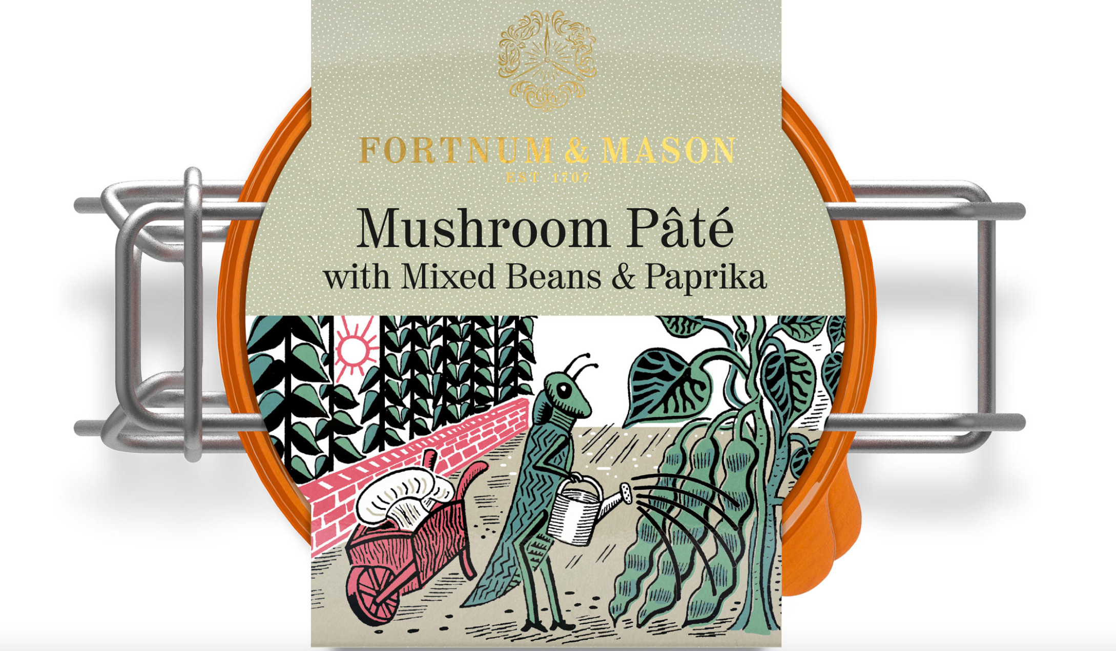
I particularly adore his illustrations for Jeremy Lee and Quo Vadis, and the way that he is able to give everyday objects – and food – a huge amount of character. Following in Edward Bawden’s footsteps, he designs packaging for Fortnum and Mason that is full of wit and visual puns. In fact, if you look hard enough, I’m sure you will see the influence of all the previous illustrators in his drawings.
I have adored John Broadleys work since seeing his illustrations on the menus in Quo Vadis and was very much inspired by the sense of fun, revelry and strong lines, when I illustrated our wedding invitations (which you can see here). You can buy originals of his work and wonderful prints, via his website. My husband Harry is an avid cook, and given he will never read this, I feel no fear to tell you I bought got series of John Broardley's kitchen themed prints (you can see below, linked here) for Harry for Christmas. If you are reading this Harry, well done for showing an interest and apologies for the spoiler!
